White-Label eSIM Data Self-Care App

White-Label eSIM Data Self-Care App

Overview

Overview

Overview

Trill Mobile, a white-label app by Mobilise, offers seamless eSIM management and mobile services. The app's outdated design and poor user experience led to low client adoption and user frustration, as the interface and functionalities did not meet market demands and the branding lacked flexibility for client customization.

The goal of the project was to overhaul the app's design and usability, boosting client satisfaction and effectively showcasing Mobilise's technological prowess in mobile services.

Role

Lead UI/UX Designer

Lead UI/UX Designer

Lead UI/UX Designer

Client

Mobilise

Mobilise

Mobilise

Tools

Figma

Figma

Figma

Collaborators

Head of Products

Head of Products

Head of Products

Branding

Branding

The rebranding of Trill Mobile introduced a vibrant and contemporary visual identity. The new logo is more modern and dynamic, better reflecting Mobilise's innovative spirit. The updated color palette is offering a fresh and appealing look while allowing flexible customization for diverse client branding needs. Custom illustrations and promotional graphics have been integrated, making the app more engaging and visually attractive. This transformation aligns Trill Mobile with Mobilise's brand values, enhancing its appeal to clients and end-users alike.

Research and Analysis

Research and Analysis

Before starting the redesign of Trill Mobile, I conducted an extensive competitor analysis, evaluating 26 competitor apps for their features, UI, and UX. This comprehensive research included:

  • Competitor Analysis: Analyzing features, UI, and UX of 26 competitor apps to understand market standards and best practices.

  • Inspiration from Leading Apps: Drawing inspiration from successful apps like Monzo and Revolut to incorporate proven design elements and user engagement strategies.

Key Findings

Common Features in the Market

Identified essential features that are standard across leading apps, ensuring Trill Mobile remains competitive and meets user expectations.

Gap Identification

Discovered gaps in competitor offerings, providing opportunities to introduce unique features that differentiate Trill Mobile in the market.

Unique Selling Points

Highlighted unique features that can be emphasized to position Trill Mobile as a standout option for users.

Opportunities for Innovation

Recognized areas for product enhancement and innovation, leading to a more advanced and user-friendly app.

Qualitative Data from App Store Reviews

  • Reviewed app store feedback for each competitor app to gather qualitative insights.

  • Used this data to prioritize feature development based on user pain points and desires.

Before starting the redesign of Trill Mobile, I conducted an extensive competitor analysis, evaluating 26 competitor apps for their features, UI, and UX. This comprehensive research included:

  • Competitor Analysis: Analyzing features, UI, and UX of 26 competitor apps to understand market standards and best practices.

  • Inspiration from Leading Apps: Drawing inspiration from successful apps like Monzo and Revolut to incorporate proven design elements and user engagement strategies.

Qualitative Data from App Store Reviews

  • Reviewed app store feedback for each competitor app to gather qualitative insights.

  • Used this data to prioritize feature development based on user pain points and desires.

Common Features in the Market

Identified essential features that are standard across leading apps, ensuring Trill Mobile remains competitive and meets user expectations.

Gap Identification

Discovered gaps in competitor offerings, providing opportunities to introduce unique features that differentiate Trill Mobile in the market.

Unique Selling Points

Highlighted unique features that can be emphasized to position Trill Mobile as a standout option for users.

Opportunities for Innovation

Recognized areas for product enhancement and innovation, leading to a more advanced and user-friendly app.

Qualitative Data from App Store Reviews

  • Reviewed app store feedback for each competitor app to gather qualitative insights.

  • Used this data to prioritize feature development based on user pain points and desires.

Before starting the redesign of Trill Mobile, I conducted an extensive competitor analysis, evaluating 26 competitor apps for their features, UI, and UX. This comprehensive research included:

  • Competitor Analysis: Analyzing features, UI, and UX of 26 competitor apps to understand market standards and best practices.

  • Inspiration from Leading Apps: Drawing inspiration from successful apps like Monzo and Revolut to incorporate proven design elements and user engagement strategies.

UI & UX Improvements

UI & UX Improvements

The redesign of Trill Mobile has significantly enhanced the user experience (UX), making the app more intuitive, user-friendly, and accessible. The welcome screen now features bold colors and engaging graphics, creating a welcoming atmosphere. The streamlined login process includes social media options for convenience, while terms and conditions are better formatted for readability. Country and plan selection screens have vibrant visuals and interactive elements, simplifying navigation.

Key improvements include comprehensive support options and advanced features like biometric login in the account management section, organized in a clean, modern layout. The dashboard clearly presents essential information, with better data usage and plan details visibility. Informative and engaging empty states guide users to take action, and success and error screens use bold colors and clear messages. The redesign adheres to accessibility guidelines, ensuring better contrast and readability, while engaging copy and call-to-action buttons improve interaction.

Additional enhancements include better input fields with various states, input masks for card details, and detailed tutorials like onboarding screens, guided tours, and visual eSIM installation steps. Overall, these updates align the app with Mobilise’s commitment to innovation and excellence, significantly enhancing the user experience and providing a more robust, customizable platform for clients. As a white-label app, Trill Mobile now offers clients a superior tool that can be tailored to their specific needs, improving satisfaction and engagement for their end-users.

Showcase Video

Outcomes & Results

Enhanced User Experience

The comprehensive redesign has significantly improved the overall user experience, making the app more intuitive and user-friendly. Users can now navigate the app with ease, benefiting from streamlined user flows and engaging visuals.

Streamlined Customization for Clients

The improved flexibility and customization options have made it easier for clients to tailor the app to their specific branding and functional needs, showcasing the app as a robust and versatile tool for their end-users.

Improved Accessibility

Adherence to accessibility guidelines has made the app more inclusive, ensuring that users with varying abilities can use the app effectively. Enhanced readability and better contrast ratios contribute to a more accessible user experience.

Reduced Support Queries

The addition of detailed tutorials, onboarding screens, and improved empty states has empowered users to resolve issues independently, likely leading to a reduction in support queries.

Other Projects

Other Projects

HERO CRM Tool Design

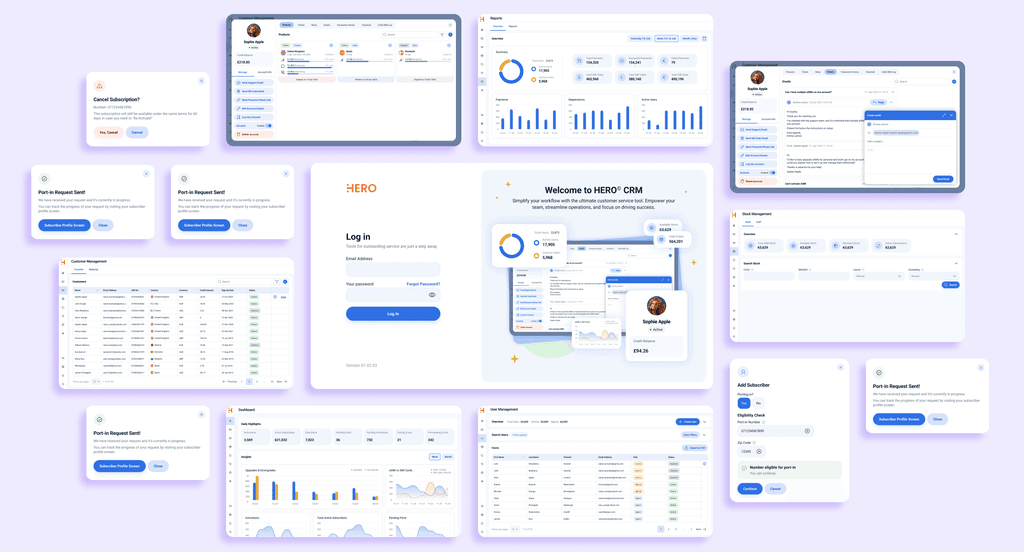
Led the design of a custom CRM tool, HERO, for Mobilise to enhance client management and internal efficiency.

Mobilise Rebrand & Website Redesign

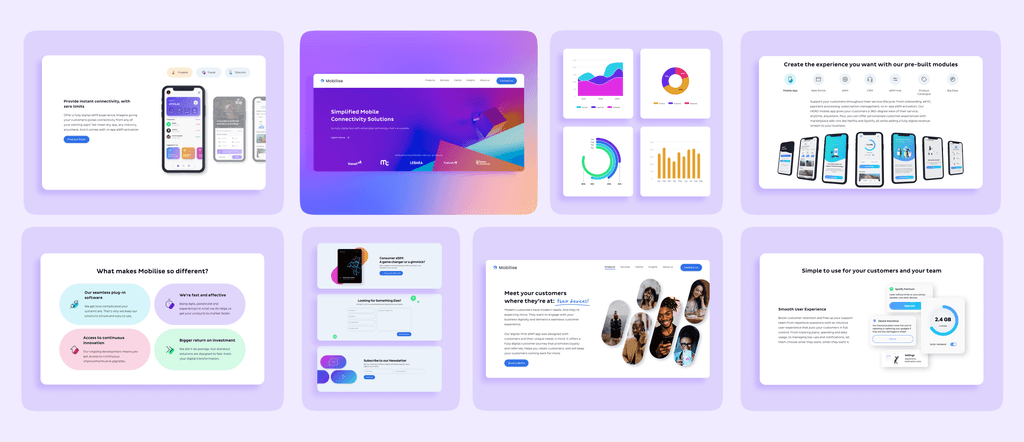
A complete rebrand and website overhaul for Mobilise, delivering a modern visual identity and enhanced user experience.

Madalina Burciu

me.burciu@gmail.com

Madalina Burciu

me.burciu@gmail.com

Madalina Burciu

me.burciu@gmail.com

Outcomes & Results

Enhanced User Experience

The comprehensive redesign has significantly improved the overall user experience, making the app more intuitive and user-friendly. Users can now navigate the app with ease, benefiting from streamlined user flows and engaging visuals.

Streamlined Customization for Clients

The improved flexibility and customization options have made it easier for clients to tailor the app to their specific branding and functional needs, showcasing the app as a robust and versatile tool for their end-users.

Improved Accessibility

Adherence to accessibility guidelines has made the app more inclusive, ensuring that users with varying abilities can use the app effectively. Enhanced readability and better contrast ratios contribute to a more accessible user experience.

Reduced Support Queries

The addition of detailed tutorials, onboarding screens, and improved empty states has empowered users to resolve issues independently, likely leading to a reduction in support queries.

Showcase Video