Mobilise, a telecom solutions provider specializing in B2B SaaS offerings, including eSIM services and digital transformation tools, needed a refreshed brand identity and a modernized website to reflect its innovative approach better. After joining the company, I identified that the existing brand and website were outdated and failed to communicate Mobilise’s technological expertise and innovative spirit effectively. The design and content did not resonate with the target B2B audience, leading to missed engagement opportunities and a weak market presence.
The rebranding project aimed to align Mobilise’s visual and online presence with its leadership in the telecom sector, enhancing user engagement and accurately representing its position as a pioneer in digital transformation solutions.
Role
Client
Tools
Collaborators
The new brand identity for Mobilise embodies the company's innovative spirit and commitment to cutting-edge solutions. The logo is inspired by Mercury, the God of Innovation, with stylized wings representing progress and aspiration. The circular shape symbolizes stability and collaboration. The signature blue color, now in a fresher shade, conveys trust and honesty. This rebranding captures Mobilise's mission to lead with integrity and innovation in the telecommunications industry.
For the redesign of the Mobilise website, I conducted a targeted competitor analysis, examining various industry-leading websites to identify common features, UI/UX best practices, and market trends. This research included analyzing notable features such as enhanced navigation, interactive elements, and engaging visual content. By understanding what works well for competitors and gathering inspiration from successful implementations, I identified opportunities for innovation and improvement. This process informed the redesign strategy, ensuring that the Mobilise website not only aligns with industry standards but also stands out with unique selling points and an enhanced user experience.
The Mobilise website's navigation was streamlined for improved user accessibility. The previous cluttered, dark navbar was replaced with a simplified, clearly labeled version on a lighter background. This redesign enhances readability, ease of use, and aligns with the modern, vibrant brand aesthetic, making navigation more intuitive and user-friendly.
The redesign introduced a clean, spacious layout with vibrant colors and updated graphics, creating a more engaging and visually appealing interface. Key content is now prominently featured with clear calls to action, improving navigation and usability. The site’s structure is more intuitive, making it easier for visitors to find information.
The redesign and refresh of the Mobilise website resulted in significant improvements across all key user engagement metrics over the span of one year:
This significant rise includes actions such as clicks, form submissions, and other interactions, reflecting enhanced usability and more engaging site features, likely due to improved design elements and compelling calls to action.
The substantial growth in first-time visits highlights the effectiveness of the redesign in attracting new visitors. This increase can be attributed to improved SEO strategies, better marketing alignment, and a more welcoming and user-friendly initial experience.
The notable increase in session starts indicates that visitors were more inclined to engage with the platform, which could be due to a more inviting landing page experience and overall site improvements that made navigation easier.
The total number of file downloads nearly doubled, reflecting the website's improved layout and clearer calls-to-action, which made it easier for users to find and access downloadable content.
The rise in page views suggests that the redesigned website successfully attracted more visitors and encouraged them to explore more content. This was likely facilitated by an improved layout, better-organized navigation, and a visually appealing design.
The increase in average engagement time indicates that visitors are spending more time interacting with the content on the site. This suggests improvements in content quality or relevance and possibly a more engaging user interface, keeping visitors engaged longer.
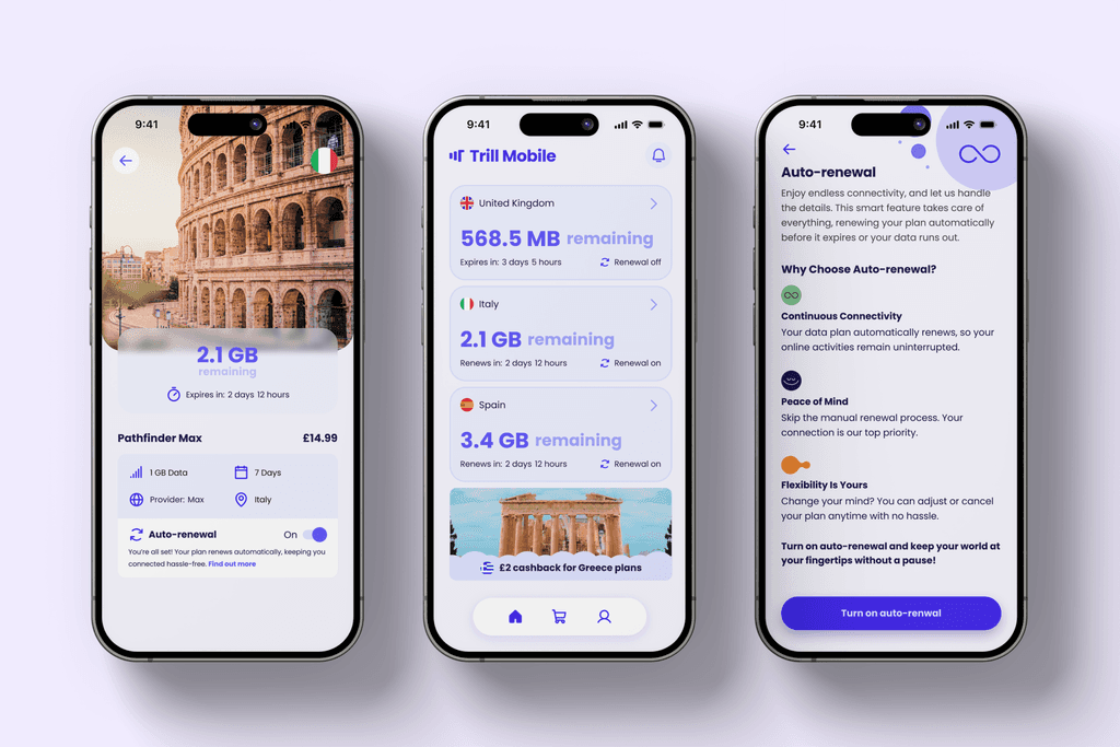
Trill Mobile App Redesign
Led the complete redesign of Mobilise's white-label app, Trill Mobile, to improve usability and modernise its interface.
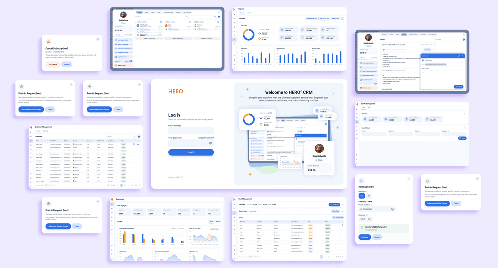
HERO CRM Tool Design
Led the design of a custom CRM tool, HERO, for Mobilise to enhance client management and internal efficiency.


